DIY Lettered Pumpkin Tutorial
Happy October, you guys! For the last couple of days I’ve been seeing the quote from Anne of Green Gables- “I’m so glad I live in a world where there are Octobers”- just about EVERYWHERE, and it’s killing me, because right now, in Ohio, it feels more like early July than early October. Where is my fall weather?! I want cool air and sweaters and scarves and soup and coffee all day and pretty leaves, and pumpkins & apples, but all I’m getting is humidity, rain, and 80 degree days. I don’t think Mother Nature got the memo.
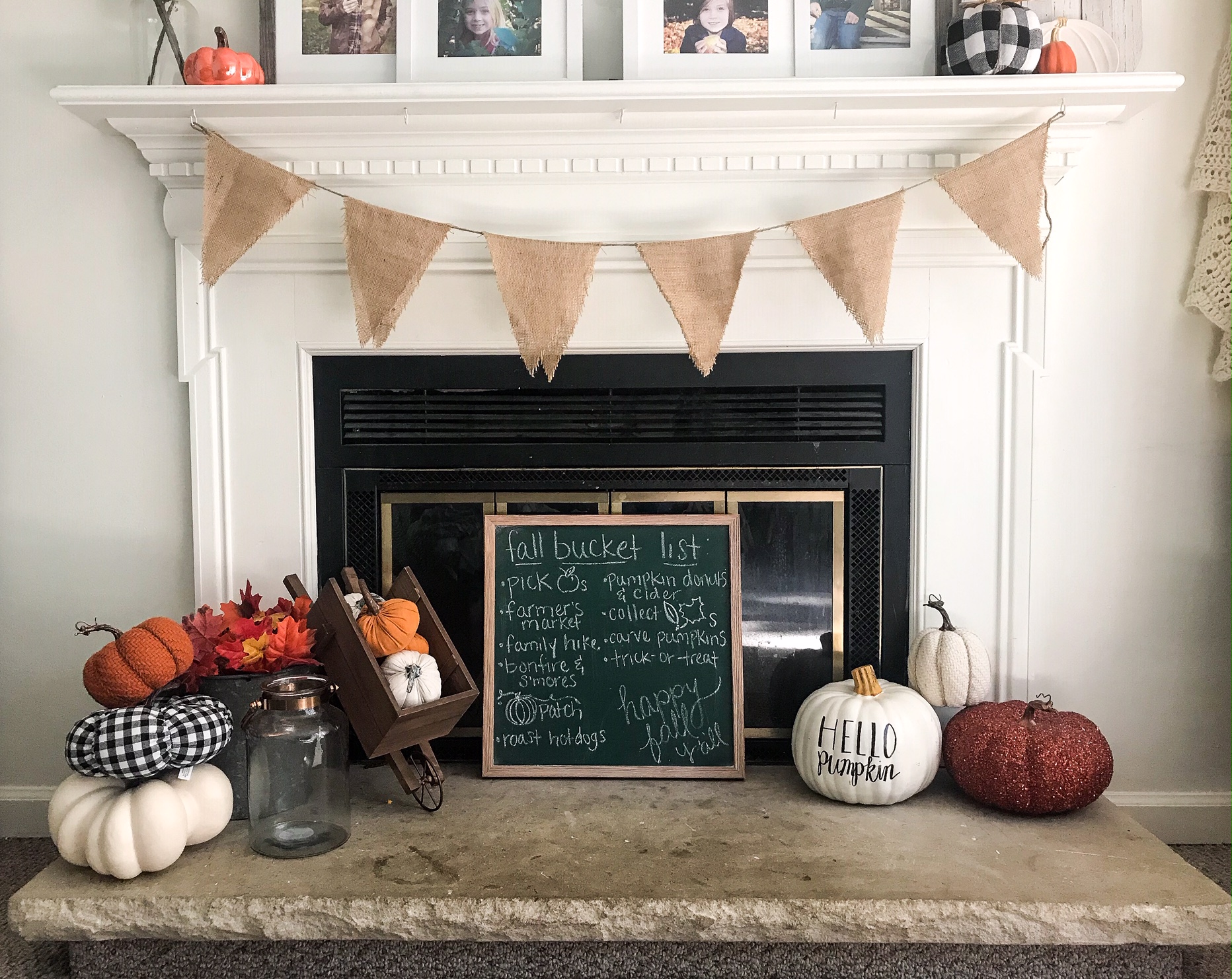
Despite the weather, I’m over here getting into all the fall activities, which includes, of course, decoratiing. I really love the hand-lettered pumpkins I’ve been seeing all over, so I decided to make some of my own, and I thought I’d share the process with you, in case you want one - or a few- too. Because, actually, they’re pretty simple to make, and they’re really cute. So let’s jump right it!

To make these pumpkins you need 3 (maybe 4) things:
A pumpkin (real or faux- you choose)
A pencil
A paint pen (I used an oil-based Sharpie paint pen)
Optional carbon paper (or chalk- I’ll explain)
First, decide on your word/phrase and sketch it onto your pumpkin in pencil. Be sure to space your letters a little further apart than you normally would- and if you’re writing in cursive, leave extra space in your loops- because we’re going to create some faux calligraphy. If you’re unsure about lettering by hand, find a font you like on your computer and print your word/phrase. Then you can either use carbon paper OR cover the back of the printed page with chalk. Lay it against your pumpkin and use the pencil to trace around the outer edge of your printed word/phrase.

Next, use your paint pen to trace over your sketched lines. Be sure to shake your paint pen well before using and apply steady pressure while writing with it.

Finally, thicken some of your lines by tracing over them a couple more times with the pain pen. If you’ve traced a printed font, just fill in the wider spaces. If you did it free-hand, choose which lines you want to thicken. For faux-calligraphy, i.e. any script lettering, you’re going to make your down-strokes thicker. If you did a hand-printed font, you can get different looks by thinckening different lines. I chose to widen the left-hand side of every letter (also the down-strokes in this case) for my printed “HELLO”.

Let it dry for a few minutes and you’re done! Go find a cute place for it in your fall decor!